Alert
Inclusion
messages framework can be included in a base template:
Implementation
Generic Base Template
Because of a global alerts center in base template described above, a message can alert the user whenever messages are included in the context of a traditional request-response cycle, e.g. messages.add(request, messages.INFO, 'This is important!')
Partial Swapping Template

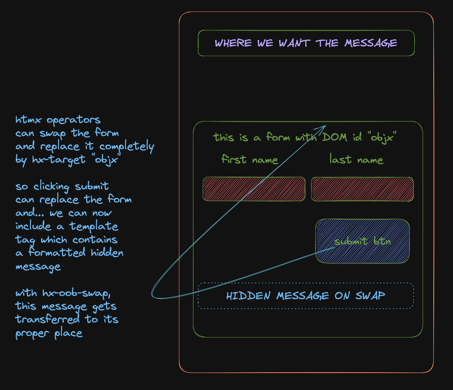
Outside the traditional request-response cyclee, the template will likely not include the alerts center considering that only parts of the DOM are modified via an htmx swapping event.
In such cases, one can employ hx-swap-oob. Here, a swap of the targeted area (as its usual behavior) occurs but the out-of-band (oob) command will enable the reuse of the identified hq DOM elemen... as if to tell it:
"new messages have arrived, show them".
This is the import of:
| Add this to the swapping template | |
|---|---|
In order to employ this strategy, this partial fragment needs to be included in the swap fragment.
Selector Styling
    def get_context_data(self, **kwargs):
        context = super().get_context_data(**kwargs)
        messages.add_message(
            self.request, messages.DEBUG, "Test", extra_tags="color plain"
        )  # (1)
        messages.add_message(
            self.request, messages.INFO, "You are now informed", extra_tags="color info"
        )
        messages.add_message(
            self.request, messages.WARNING, "You warned", extra_tags="color warn"
        )
        ...
        return context
- won't be displayed since DEBUG is not record as default, can change though per request
<section id="hq" hx-swap-oob="true" aria-live="assertive">
  <div id="msg-1" class="color info info" data-level="info" _="on load show me ">
      You are now informed
      <button id="msg-close-1" type="button" _="on click remove #msg-1 end"><span class="sr-only">Close</span><svg aria-hidden="true">...</svg>
      </button>
    </div>
    <div id="msg-2" class="color warn warning" data-level="warning" _="on load show me ">
      You warned
      <button id="msg-close-2" type="button" _="on click remove #msg-2 end"><<span class="sr-only">Close</span><svg aria-hidden="true">...</svg>
      </button>
    </div>
  </div>
</section>
This is based on the blueprint found in the simple msg.html. If modified, just ensure the inclusion of relevant tags:
| Selectors to use | |
|---|---|
- The
idthe close button to refer to the message - Extra tags and the traditional message class names ('error', 'success', etc.) are included here
- Instead of lumping it in a class, can be more deliberate and add a dedicated data-* attribute